UI: Group Directory wires v1-7

Group Directory UX, proposed redesigns [in progress]

See latest version here

Round 6 and 7

not documented here, there were a few furious rounds via email, but not uploaded, you can see the resultes in the link above, version 8 and beyond.

Round 5

Landing page

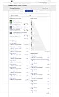
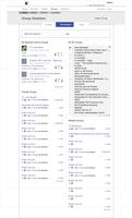
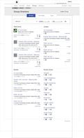
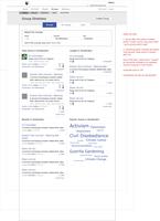
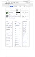
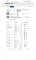
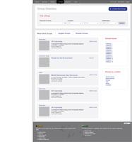
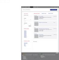
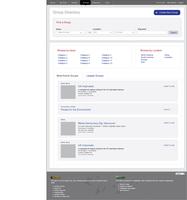
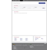
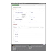
Four columns on the landing page, plus a way to filter. Ideally we could search for an issue and within a geographical region. Under the search area there is a link to All Groups, which will be an alphabetical list with committees revealed. The four columns in this round are, Most Active this Week, Popular Issues, Newest and Open to Join. Popular Issues is a tag cloud! Open to Join are all groups you are not a member of that are open for membership. The join and request links should open popup that allows instant joining or request sending!

Also in this wire is the joining a group story more elaborated. We should have four states: join group (for open groups), request membership (for groups that want more control over membership), request sent, already a member,

Dropdown lists vs auto complete is not yet decided upon, but we will probably go with drop downs, so I’ve made this wire with them.

landing page

My Groups general

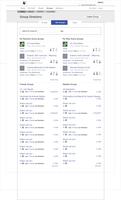
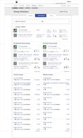
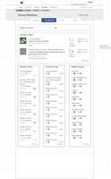
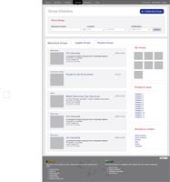
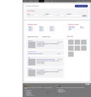
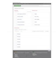
In My Groups we have decided to have a search function if technically possible, and four panels like the landing page. The four panels will be My Recently Active Groups, All My Groups, Friends Groups, Related Groups. Like the wires of rounds 3 and 4, My Recently Active Groups has the most meta data revealed.

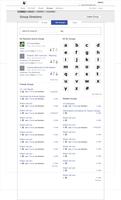
There are two ways to have the “All My Groups” alphabetical list in one of the four panels. A vertical list or a rectangle of squares. Both are explored below.

My Groups (alphabetical list)

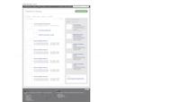
This one is the vertical list. The clickable area is staggered to both use the white space up, and give the uer an increased area to click in, making hitting the “target” link easier. The “arrows” or whatever other graphical button style we use, should change with roll over, but probably shouldn’t change size.

There is a link at the bottom of the list to view the whole list.

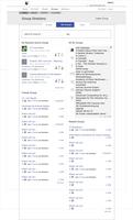
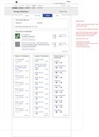
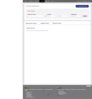
Once a letter has been clicked, a tabbed window opens, with the other letters below, greyed out, but still selectable. To get back to the whole list, you can also close the window, ajaxy style! There should also be next previous type links when the list is too long for the window.

alphabet grouping as list clicked on A

My Groups (alphabetical squares)

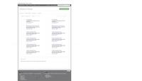
Pretty much the same as the previous, only with letters displayed in a square. They are probably too big, but if we have them smaller, they should expand with rollover, like the iPhone keyboard. We need the hash in there for every group not starting with a letter. That should be in the above wire too…

alphabet grouping as square clicked on A

Round 4

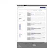
Rocking a two column layout:

Landing page with drop down search

landing page – drop down lists landing page – dd lists v2 with tag cloud

Landing page with auto complete search

landing page – autocomplete landing page – autocompleted amsterdam

myGroups

myGroups myGroups with admin

Round 3

group landing page group landing page with drop down choose country group landing page with drop down choose city group landing page with drop down choose global
my groups places

Round 2

Round 2 version 1

Version 1a Version 1b Version 1c

Round 2 version 2

Version 2a Version 2b Version 2c

Round 2 version 3

Version 3a Version 3b Version 3c

Round 1

Possible approaches to the Groups Directory screen. Takes into account conversations with Daniel and Elijah.

These wires emphasize the following user needs:
• ability to find groups more easily
• ability to scan group info quickly and broadly to determine if it’s one they might be interested
• suggested groups they might be interested in

Version 1

Version 1 Version 1b Version 1 (lower level screen)

Version 2

Version 2 Version 2b
 

The image upload function isn’t working properly for me at the moment, so I uploaded the wires as jpg attachments and hopefully can go back and upload them directly inline into the page.


nice to see wireframes coming in for this. I love the little tool tip bubble with the group description. I think this could be used in more places.

I think it makes sense to have ‘my groups’ separately from the group directory in contrast to Version2. There are a number of ways to get to my groups. I know them and i should get there really fast. While looking for a group i am not a member of is a totally different task. That is when is start browsing the directory. My groups should show up in there for sure but i’d rather not have them listed extra.

I really like the sidebar with related groups in Version 1. I think we might want to encourage people to improve their group information and then have something like featured groups on the site. Currently stepping through the group directory is fairly boring / frustrating because a lot of groups do not have much information on their public profile. Making those who actually provide content and want to be visited more visible might help.


quick comments more to come.

Search field

  • in crabgrass the search field is in the banner, and the banner determines the context of the search. so if i search from the cgdev group i’m only seeing things in that group. the same would be true for group directory, unless we decide to feature search more prominently.
  • i agree with azul, we need a link or maybe a small sample of “my groups” but we will have drop down menus with my group info, and it is also displayed currently on dashboard, so i think it can be minimized to allow for more interesting things.
  • groups you might be interested in section – nice! we would also want to combine near me and similar.
  • As directories get bigger, new groups wont be as interesting as new groups in your area and / or new groups that share your interests.

Things that are good from other directories

Facebook:

  • social directory is first order category: They show you Groups " Recently joined by friends"
  • it shows your groups, but only ones that were recently updated, with a little bit of group activity information.

Meetup.com Browsing (i think meetup has the best directory!)

  • everything is a combination of location and topic.
  • browse city is cool
  • combines events listings with groups, so when you browse to a city it has three tabs, 1) group 2) whats happening this week 3) Newest and Largest
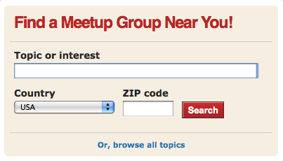
  • super prominent search

Google Groups

  • Very extensive regions listing when browsing. Every region has a count of the number of groups in that region.


Notes on the wires:

There are two versions of Groups Directory presented in the wires above. All of the features and functionality proposed were in an effort to strengthen the experience of finding information a user might want about groups they are already a part of and discovering new ones they might want to tap into.

Version 1 features:
• Makes the Create New Page button more prominent and adds Search functionality
• Uses existing tab structure and contains My Groups within the larger directory of Groups
• Give better high-level overview about what’s happening in a user’s group by displaying last updates.
• Calls out the Browse/Find Groups experience via a panel that recommends groups to a user based on location, related issues, etc. Surfacing this info helps users browse and discover relevant groups more easily.
• Also enables users to find groups based on keywords/tags

Version 2 features:
• More modular panel approach for the Groups and separates out the My Groups from Featured/All
• Shows how additional info might be surfaced with rollover bubbles

We can figure out which elements we think are working best and are strongest and look at combining that into one cohesive experience.

Some of the comments above sound like you’d like to move more distinctly towards having the Groups directory be a Discover experience, which isn’t a hard thing to do. Would you want the same for the People Directory and Network Directory?

I still need to look a little more closely at where the synergies are between Network and Group Directory and also look into possible ways to collapse the two. Think this is one area that really needs to be clarified or these two areas will remain confusing, possibly even more so with some of the changes proposed. If you guys could provide some clarifying thoughts about the Groups/Network dynamic, that’d be great. I’ll think of some ideas by our Tues meeting in the meantime.

Footnote: It concerns me a bit working in a vacuum with just one section at a time and I think ultimately, the decision for which direction (and approaches to use) should be viewed in concert with how ideas/UI conventions can be used throughout the site (I’m sure you guys are already doing this though….)


Additional notes from meeting with Elijah and Daniel re: Groups Directory

Interested in reworking:
• Group Directory (logged in and not logged in versions). Should include Search, most active groups, my groups and taxonomy/browse UI.
• search results page and
• a lower level if it’s still relevant (ie. Most Active Groups)

GENERAL
- How does browsing a category and location act within a search?
- Group listing summary data is still TBD.
- Don’t want to have Most Active Groups or Recently Created Groups featured as prominently on the landing page. Perhaps have five or so showing at a time.
- My Groups should have a presence on the Directory landing if you’re a logged in user.
PUBLIC VS PRIVATE
What information is displayed and searchable based on your access rights or privacy settings for the group? In Meetup, all their groups are created as public, but in CG, access to group info can depend on if you’re a part of the group already or not. Groups can determine their own levels of privacy and security.
- ie. Location might be public/private, same with # of members.
- Everything in a group listing is potentially private except the name.

SEARCH
For starters, will definitely have search capability on the Directory pages, but not necessarily Browse since they’re still developing the taxonomy now.

- Currently uses a full text search engine (name, description, adddress, etc.)
- Can design UI to sort results on page based on types of matches (ie. category, text search)
- Users should also be able to sort results based on relevance or location.

BROWSE
Wants to be able to browse based on category and location. Riseup is developing the taxonomy now but likely 12 or so top level categories based on issues.

Networks
The whole purpose of crabgrass was to facilitate collaboration between different people/activists/groups.
- Networks are a collection of groups, a shares space to work together. When creating a network, it needs to be clearer that this is the primary use.
- Networks will likely use the same approach to Directory as Groups so don’t need to focus on this for now.


Hey just wanted to pass on some comments from Cherif.

1. be able to sort groups as per their openess or at least show in the list which ones are open/private/upon request.

2. have a couple of lines of the group descriptions be shown in the list of all groups.

Cheers guys!
Cherif


Hey so i think there are too different types of user workflows here.

1) User looking for something specific (group she is in, group in his region, group about a subject)

2) User is looking at what is going on. (what groups are popular, what are featured, what her friends are in)

The first workflow would be search and category based the second social intelligence driven.

useful things to be exposed for all of the above include
a clear visual based representation of the 1)openness of the group 2)whether the group is regional or global 3)whether the group is virtual or real world.

So in some ways that would include regional and subject based tags or some such thing…


UNICEF feedback to round 2, versions 1, 2, 3:

  • UNICEF <3’s 1
    • makes the groups primary
    • uses the space efficiently
    • search seems better realized
    • likes the blend of social and work
  • Tabs
    • Tabs structure feels like it needs fleshing out
    • breadcrumbs might solve this
    • might need a return to groups on the touchstone
  • Issues
    • Don’t know about issues, since it doesn’t exist yet
    • Love the idea of tags
    • a folksonomy doesn’t need maintenance
  • Side filters
    • concept needs to be developed
    • is this like search results?
  • People
    • should follow the design patterns for groups
    • agree about the people directory should be different


ronni, digging these! also like round 2, but as stated in the meeting worried about how the browse by category, and location work as nav or jump off…


Search:

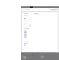
  • search should just be a single field. i don’t think we gain anything by forcing it to be a separate field. one thing we can do is just return search results for places. so, for example, if i search for ‘santa cruz’, the results would include groups in santa cruz but also just the place ‘santa cruz’.
  • you should be able to search within a context (place or issue). this is the big one. when i browse to a particular context, the search should be able to be limited to that context. for example, i should be able to browse to california, and then search for “food not bombs”. this implies that the search is displayed in a nested context to the place/category.

Top landing page:

  • break out issues and include (some) sub-issues: there are some directories that have way too many links, like craigslist, but i think it is generally more useful to include a few second level links.
  • break out places to include sub-places

Missing:

  • landing page for a place or issue: if you look at the different directories from sites like meetup or zvents, they put a lot of work into getting the place and issues overview pages right. i think this is tricky.
  • what it looks like when you are browsing in different levels of context.

Concept hierarchy:

  • place/issue
    • search within
      • filter by ‘most active’ or ‘largest’ or ‘newest’ or ‘open’.

If possible, i would like to loose ‘browse’ as a navigational element. It is not real strong conceptually, in that you are always browsing.

I think the main problem to solve with directories:

  • how to provide strong context based on place or issue
  • clarity in navigation so that it makes sense when you want to find a particular issue and a particular place.


Would it be possible to also differentiate between “request membership” and “join group” depending on the groups’ settings?

This would save a click and allow users to join directly from the group directory.


Round 3

  • diggy the blocky nav
  • interesting to see the gaurdian-eske breadcrumbs, takes up space, but really makes it feel like another nav…
  • i like the my group ideas
    • I like the extra breakouts for my groups section, related and my friends groups is cool.
    • i like the meta info regarding request, etc
  • my groups —> since they are your groups, you might not have to see the summary, at the same time it is nice to look at what others would see
  • three column design i dont think will work, two thin (i know its early and these are more just placeholders, but thought i’d say it:)
  • if there is search in a location, its kinda wierd to have “search in location” check marked in the masthead.
  • group landing page – most active i think should be most active near me when possible (not based on ip). also i wonder how activity is gauged if groups are private spaces.
  • we probably need a way to distinguish committees from groups, at least show that they are a subgroup.
  • largest is interesting.
  • we should also make sure to break out open groups, ones that are open to join vs ones that require you to request for membership. and in the directory in general this is meta data that should be revealed.
  • I wonder if we should combine the groups landing page with place. at least the way it is now i’m not sure the benefit of the two. as soon as you search by place in the groups section, well, it would look basically like place, yes?
  • peep meetup for meta info – one example if i go to nyc and search by topic, we could say that there are 50 groups in nyc that are tagged / categorized as that topic. of course we need always concider privacy.