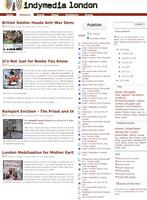
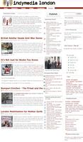
we came up with following designs at the Design Meeting Oct 09
Wire Pages:
this layout is meant for: newwire page, events page, video page, as sort of second frontpage, or portal. It could also be used for specific wires like tag-article-wire or group-article-wire (or event or…)
Groups Page
I just used existing lists and wires, but obviously the upcoming events are the groups events and the videos and other media posts those of the group. it would be great if the tags were also those used by the group, rather than the generally most used ones. Also obviously the main wire would include all posts by the group, not only featured ones.
There was also the idea of giving groups the choice what to have in their main wire: articles, events or videos in order to support groups like social centres who don’t write much, but use the calendar. In that case the newswire would be in the place of upcoming events and the main section would be an events listing.
|
Please Feedback here or on the lists! Personally, looking at this, i think we need more empty space on the site, it’s looking far too crowded. |
|
|
Indeed Resume Writers helps with mental imagery and practical comprehension of the final product. |
|
|
I think the site needs more empty area retro bowl because it appears to be far too busy. |
|


