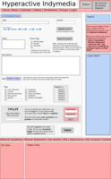
Ok, now here goes. A view things first that go for all these:
You might want to check out the actual frames below first, otherwise all this probably doesn’t make too much sense.
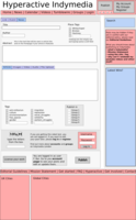
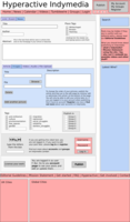
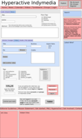
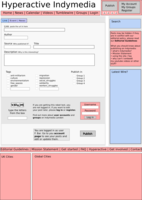
- Login: I put a login window at the end of the form next to the captcha. This is to remind people to log in if they want to be able to edit their content. Now the question is, can people fill in the form and then log in keeping all the fields filled in and stuff?
- Tags: I got rid of the separation between tags and categories. So proposed topical tags are still listed for ticking, followed by two tick boxes with empty fields next to them. The idea is that if someone types into them, they get automatically ticked and a new empty one shows up below that. Not sure if that’s making a lot of sense to everyone, I’m happy to try and explain. For place tags I wasn’t thinking of having category tags, but of having the three (or whatever) most popular ones suggested with a tick box and then another empty field, with more opening up as they are filled in.
- News: nothing was called news before, but it seems to make sense. It clarifies the separation from event / link / insane rant / … and includes all media types. Article very much refers to written text, and it doesn’t seem to make sense to start having a million separate publish forms. Also in the spirit of bringing the fragmented site together, this is all news and this is all stuff that goes into the newswire. To keep things fairly simple, I made a tab system rather than a long form. I hope this doesn’t imply to people they would only be able to publish one kinda media. The main body of the article goes in there, as it’s not really needed for pictures, videos etc. So I guess only one of these tabs has to have something in it. Not sure if this would be working all that amazingly, but it looks a lot clearer and less confusing. Of course all the media types should be included in the appropriate special wires (like videos) Again, if this is not making sense, I’m happy to explain.
- Info bit in the right sidebar: rather than getting rid of the sidebar, it makes sense to have basic information in there, rather than cluttering the actual form. That goes for the Editorial Guidelines obviously, but should include some stuff people keep asking about, like embedding stuff from elsewhere, maybe some info about privacy policy / IP blah, and last but not least some information about what Indymedia is and tries to do. Some historical thing could be nice, the way the stories are always told at presentations. I guess this would have to be customizable by collective, so it’s like a snippet or something maybe.
- License: just for kicks I included a button to let people license their work, as we’ve discussed this repeatedly but never came to a conclusion.
- as for the Zines, I wasn’t sure about that. I still don’t really get why there’s a special publish form for them really (having a zine library is a great thing, but I guess for me it’s still more of an independent project from Indymedia, no offense to Northern England, having said that, having the pdf viewer for uploaded pdf files is pretty cool). If I’d be thinking of another content type, I’d probably include Press Releases. Lots of groups make them after an action and they kinda only half fit into the newswire, it’s more of an own format, and might merrit it’s own publish form. People who are busy spreading the Press Release generally just want to copy and paste the whole thing and not deal with lots of fields that have to be filled in.
Oh, and the bold words in text are supposed to be links, could figure out how to underline or change the font colour. The Typewriter text is explanation that’s not supposed to be on the site, but for better understanding now.
go back to wireframes
One publish form with different faces: Publish News
and the other publish forms:
