|
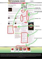
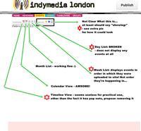
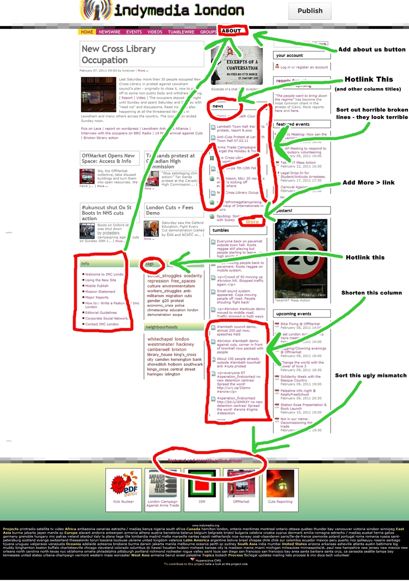
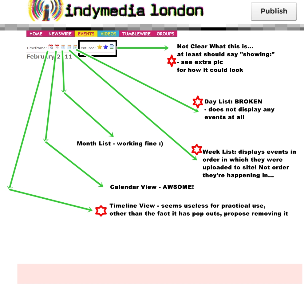
See pics above for simple precis :) FRONTPAGE: - Add a pink ABOUT button in line with the other top level links (like NEWSWIRE and GROUPS), linking to the about page at london.indymedia.org/pages/about - The NEWS column does not have a link to “more →” unlike many of the other wire columns – should be added. - The thin black vertical lines that edge the columns look terrible. They’re broken in several places and sometimes urls run over them in tumble column. How can this be fixed? or removed? - Tumblewire items on frontpage – they only really move if people are out covering a big demo, so shorten the number of items to like 5 to provide more space for more important stuff, like the main ‘news’ wire. - As has been mentioned by others before the “featured and recently active groups” title is almost illegible being placed right over the black and grey pixel box line at the bottom of the page. Can it be moved? - TAGS – the tag cloud isn’t really being that useful since it’s displaying all time top tags (which are obviously going to mostly be the category choices that are provided for people). Can the TAGS title link to a page which shows all the tags people have used? Just by way of illustration, after the biggest and most full on demos in london for a while there’s no trace of the tags “student” “ema” “dayx” “demo2010” “fees” on the frontpage. And no link to find them. At the moment it actually makes the site look like it’s got far less content than it actually does. CALENDAR This is one of the BEST features of the site and seems well used – it should be promoted more! (like a sunday evening tweet each week saying check out all the cool events going on this week on Indy Ldn calendar, + add yours!) But there are a few problems with things not working properly, and navigation being a bit arcane and confusing: - DAY View is BROKEN – it’s displaying nothing at all, zero nada zip. - WEEKLY View – is displaying items, but in the order they’ve been uploaded in, rather than the order the events are actually happening in. - TIMELINE View – it’s a cool bit of functionality, but I can’t work out how it’s of any use what so ever! I think it’s just confusing having it as an option (esp the first option). I’d propose just getting rid of it as a linked option. - NAVIGATION: After the icons for choosing the “Timeframe”, there’s the word “Featured” then the yellow star icon, blue star icon, and article icon. That’s really confusing, since they don’t allow you to filter any particular timeframe view by event type (featured, promoted, all) – but simply return a list of events by type irrespective of timeframe view. So it would make sense to replace “featured:” with “List only” or display, or show or something like that, then use some text next to the icons to make it clear what they are. Remember, it’s fine for ppl who know their way around the website to have unclear navigation, but for new visitors it’s making life difficult. PS when you select the article icon – ‘all events’ – option london.indymedia.org/events you get to see the first page of events in chronological order, then there’s a tiny “more” link at the bottom (which should be bigger and more obvious) but when you click that you get taken back to JANUARY 2009!! london.indymedia.org/events/archives/2 which seems to be because the latest events are page 62 backwards, rather than page 1 and going forwards! |
|
|
The atmosphere in horror games is unmatched! The sound design and visuals create such a tense environment that I can’t help but get fully absorbed in the story |
|
Feb2011 Frontpage, Calendar and other useability tweeks
Just Planet trying to note down small things to change / fix to make site easier to use
